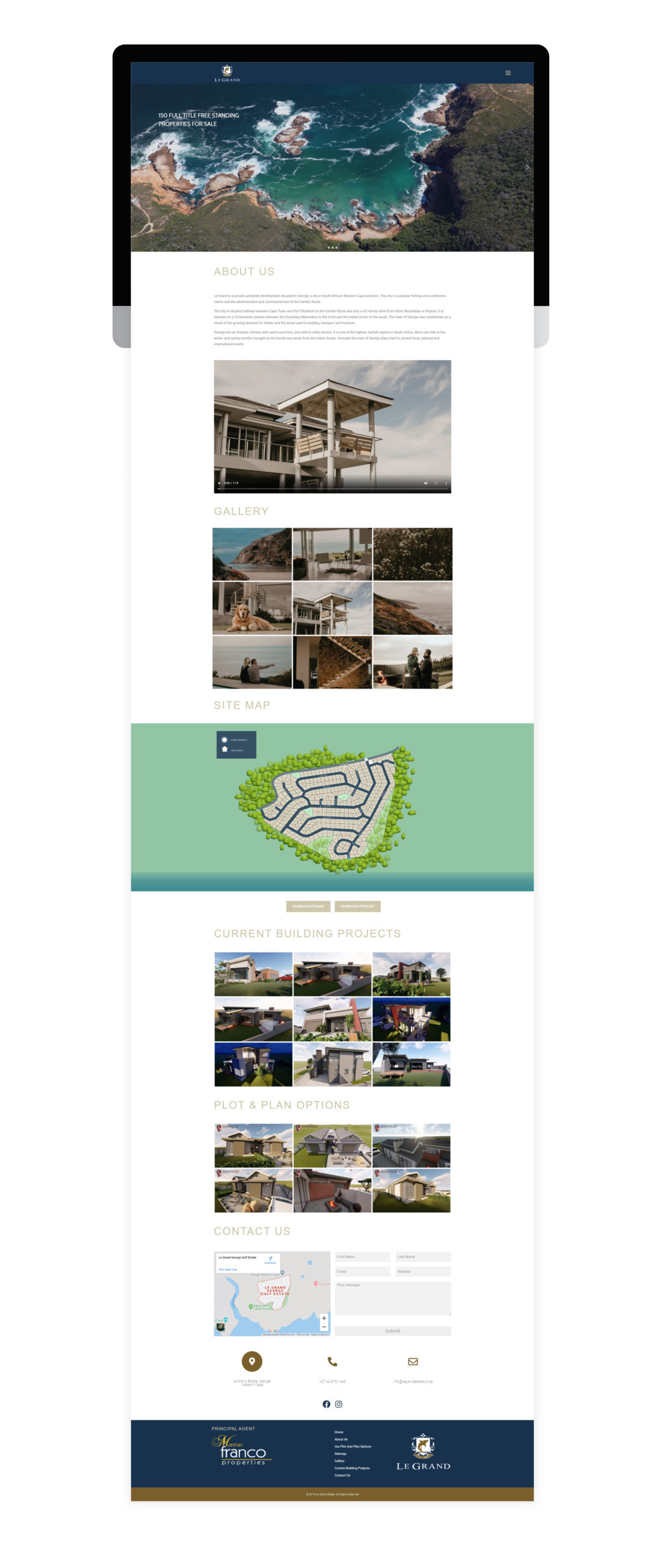
– Responsiveness optimization for tablets and mobile devices.– Development focused on optimal user experience.– Site testing and debugging done to finalize site launch.
– Optimized Responsiveness– User Experience Focused– Site tested and debugged.